
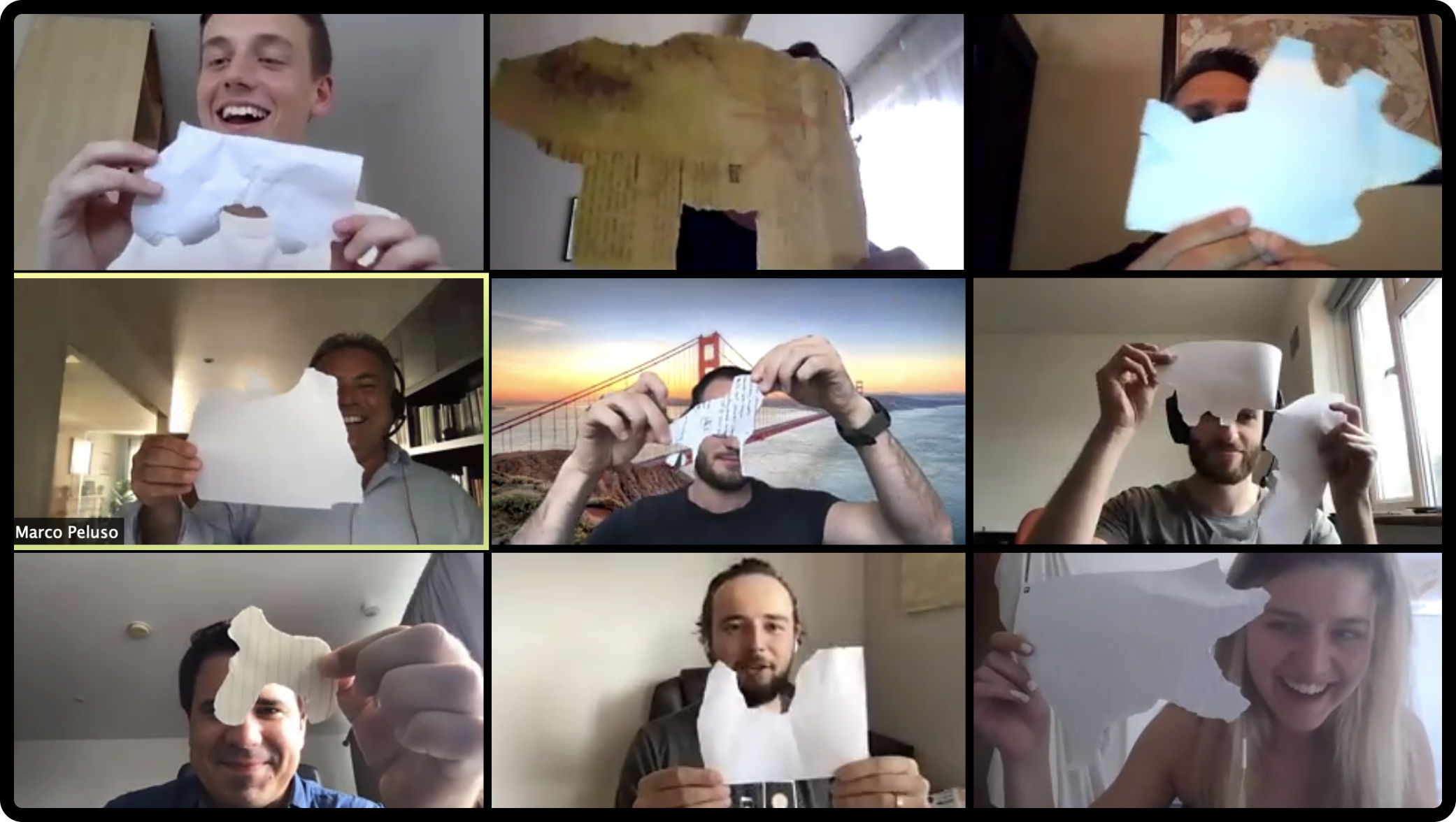
Everyone. Here’s a story on how we collaborate…
Separated by work-from-home setups, yet unified by Slack - this week we collectively tuned in to watch Apple’s announcement, anticipating the news we were hoping for… the release of iOS 14, and therefore widgets on the home screen.
This was part two to June 2020 - at the Worldwide Developer Conference (WWDC), when we first heard about the features Apple would be releasing this year. We listened as ideas began to buzz around in our brains, and a few days later the full Epsy team (virtually) met for an ideation session.
Taking the format of a Round Robin brainstorm using the remote too Miro, we placed a card to represent each new iOS 14 feature around a “table” and invited each team member to “have a seat” at a card. These were the rules:
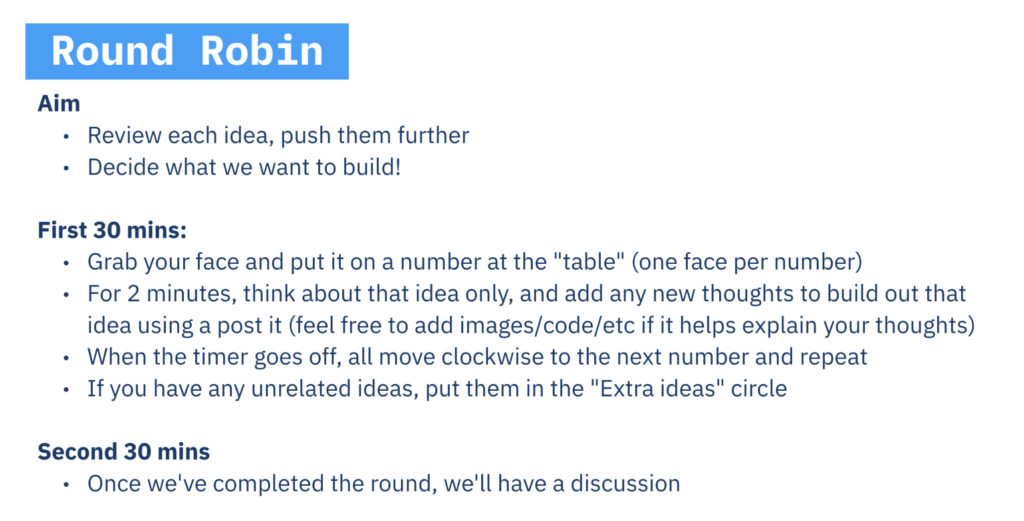
This setup ensured ideas could be pushed to their full potential, because we all spent focused time thinking about each feature and built on previous teammates’ contributions, which made them even stronger.
The end board looked like this:

The colourful dots on the third card represent a standing ovation of votes. The team had spoken - we were all in favour of tackling widgets first.
According to Apple, “a widget’s main purpose is to display a small amount of timeley, personally relevant information that people can view without opening your app”. We believed that Epsy, being an app to help people on their everyday path with epilepsy, should facilitate this feature first. And so the designers left with inspiration to create a delightful experience for our users, accompanied by the engineers who fearlessly guided feasibility and of course, conducted by our product aims to help users remember to take their medication every day, leading them to form long lasting positive habits.
We went through a few design iterations of widgets:
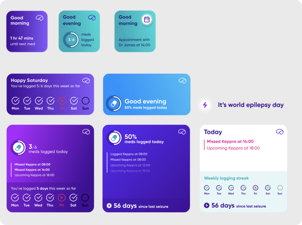
While we agreed on the direction and content, we also agreed that the first design iteration’s use of empty space - while appealing to the design eye - wasn’t utilising the widget’s real estate to its full potential.
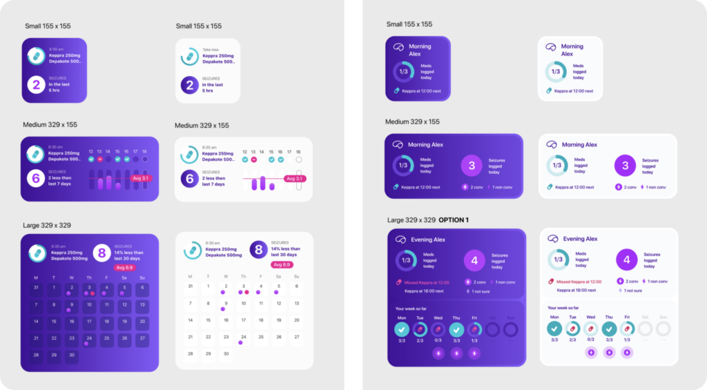
The next rounds of design explored how medication information could be represented in different ways, encouraging logging by exposing user progress. When Product, Engineering and Design banded together again to review, we agreed the use of space was more successful but we’d slightly lost the focus of medication - the winning design would need to be clear.
The last review was for a tougher audience. Because widgets weren’t yet released to the world, we kept our testing guerrilla, turning friends and family into testing subjects. Providing them with no information except a question, “what does this mean to you?” and hearing our hypotheses repeated back to us, gave us further confidence in the current solution.
Finally, the part that brings it all to life: engineering’s collaborative piece. Each stage was shared to the wider team, met by a full chorus of support in preparation for the release. And after weeks of hard work, the Epsy team is thrilled to be able to share the Epsy widgets with our community.
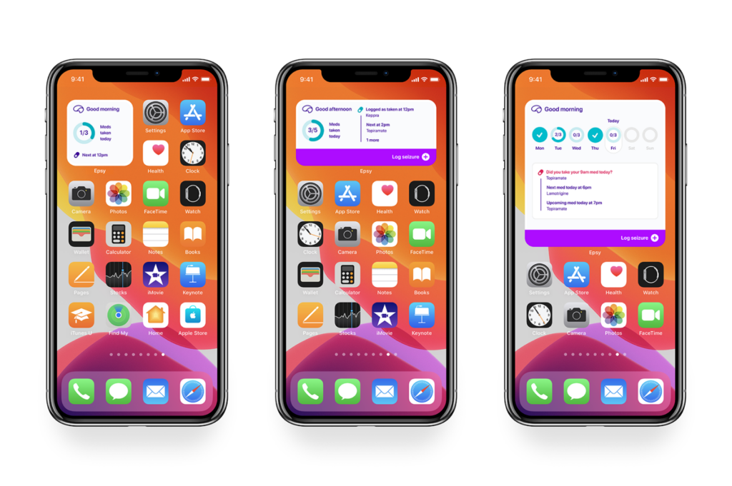
The new Epsy home screen widgets concentrate on the primary goal of helping users to take their medication. Widgets are available in three sizes (small, medium and large) and support light and dark mode. The medium and large sizes have the ability to show more information that dynamically changes throughout the day and week, and these versions also offer a quick seizure logging button - enabling just one tap to log a seizure.
What happens next in the Epsy team? Once our users have had the chance to play with Epsy widgets, we’ll follow up to hear their thoughts and suggestions. And of course there’s still a whole table of other ideas that are drawing us in…
