
What do Epsy Android developers and designers have in common?
They all care about making an Epsy user’s experience as delightful and effortless as possible.
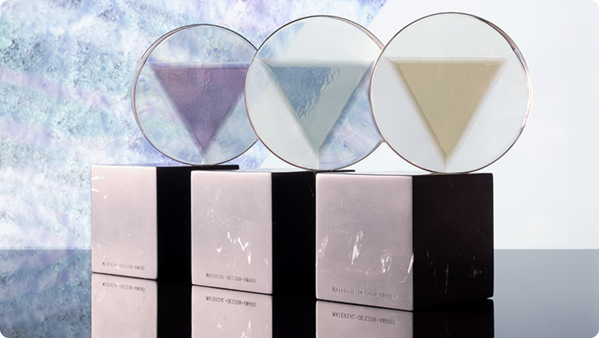
Google runs their Material Design Awards annually, each year announcing new categories. Epsy was particularly piqued by the Motion genre in 2020, as something that we had already woven into our user experience. The team had been quietly stacking up tickets that detailed ideas for further polish to our app’s animation and so - delighted with the excuse of an award entry deadline - we set into an adaptation of a feature sprint to bring it all to life.
Week 1 was dedicated to design. A working group of 5 of us put on their critical design eyes and individually evaluated the app, tasked with answering what we could improve to further simplify user interactions, yet also heighten delight. Were transitions intrusive instead of intuitive? Was feedback jarring instead of calming? Our first meeting revealed an honest audit of our app, plus a showcase of examples of work, which we hailed at achieving both practically and beauty in their executions.
Using Material Motion’s handy framework as a base, we identified a few additional guiding principles for ourselves, helping us to maintain the integrity of our brand and intention of our mission. Designers worked on crafting moments to match this system, packaging them up in Lottie files ready for development.
Week 2 focused on development, with designers on hand to lend a helping eye. We met for 15 minutes after each standup to test and finesse, and at the end of the fortnight the app was refreshed and the tickets were closed.
This was the system upon which we based our improvements:
It should feel progressive
Epilepsy is one of the oldest known conditions in history, diagnosed in over 65 million people worldwide, with millions more being added to that number each year. However, it’s incredibly difficult to understand because the condition differs so much between each person, making treatments difficult to personalise and clinical advancements slow to develop, especially when compared to the rate of so many other innovations in healthcare today. Epsy was built to change that: to accelerate patients to the right treatment, bringing progression to our users as we join the drive to advance epilepsy. This movement starts with everyday moments in our app: with every log and every insight gained, users move forward in their journey.
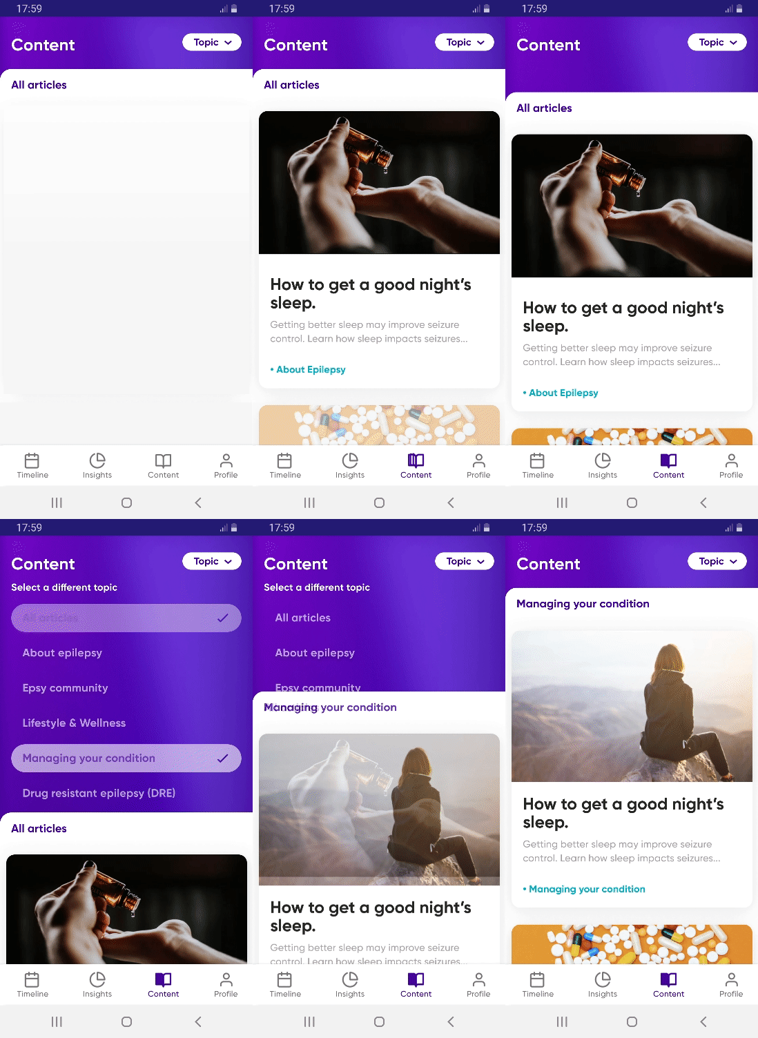
The anatomy of the app is built in layers and controlled by expressive, yet intentional interface animations, encouraging user progress and bringing focus to tasks. We use visual cues of lights, shadows and gradients from key and ambient lighting to help portray the user’s progress in an encouraging way.
Epsy is for humans and it should feel human
There are two parts to this. Our app should feel responsive in every interaction, complimenting the expectation of the human using it - therefore every action made should have a reaction. It should also convey and evoke emotion - this is found in the storytelling and magic that makes users reach out to tell us they love Epsy. These two things are achieved in the app’s polish, which truly sets us apart.
People have to log into our app every day, multiple times a day. And it’s important to us to consider how we make users feel. We cannot present an obstructive or annoying experience: users should want to come back because they feel optimistic and encouraged in their epilepsy journey. We focus on making that journey joyful.
Upon launch of the app, our logo animates out of a sparkle that moves, taking the shape of a brain and generating a subtle visual echo that propagates from the center, like a wave. The logo also doubles as a speech bubble to symbolise improved conversations between patient and doctor.

The Log button helps nudge people to know what to do when they first arrive. The animation you see when you interact with the Log button provides feedback, a subtle and optimistic sprinkling of motion - to further inform the user but also aiming to keep that moment magical, which is important because they may be there to log something they feel the opposite about.
It needs to be intentional, yet feel effortless
We’re committed to consider our users’ varying cognitive states when interacting with our app - they may have just had a seizure for example, and could be in a more vulnerable position than usual. Epilepsy also affects the memory - because of damages to the same areas of the brain, side effects from medication and various other reasons. So we hold ourselves accountable to make sure every step is effortless, that in moving from overviews to detailed views, context is clearly maintained throughout - best practice for any app actually.
We’re here to help remove stress, uncertainty and fear, so each interaction and transition is carefully considered to promote a calming and intentional environment.
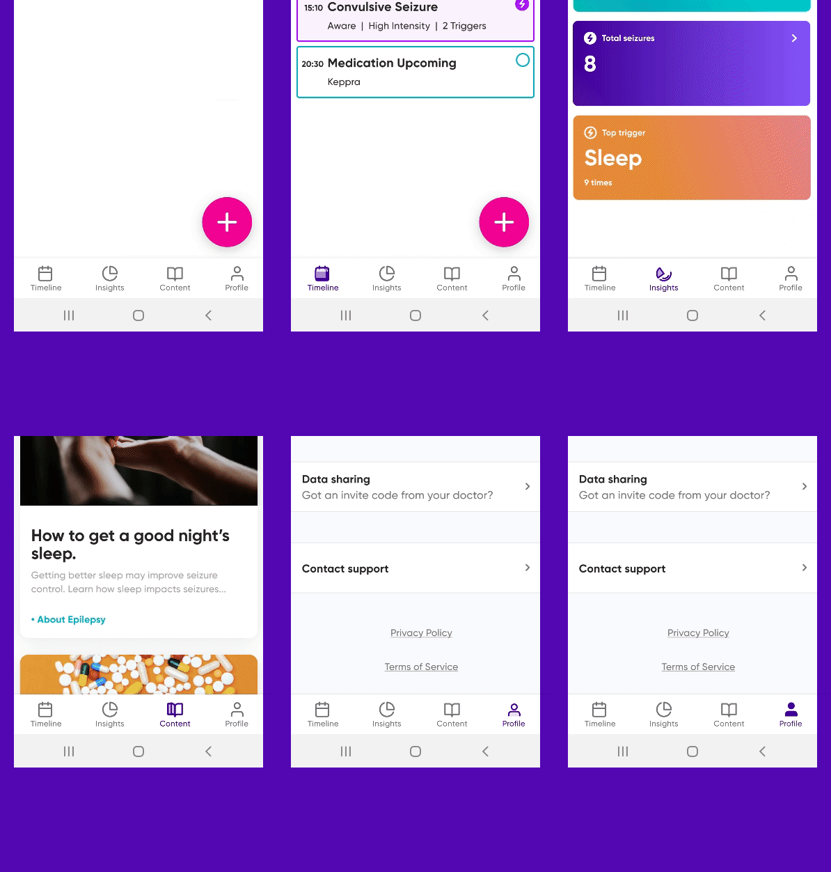
The bottom navigation animations help anchor the user in the experience, providing useful and also delightful feedback when tapped.
Epsy should also work without any motion
This is a controversial one. It’s been said that motion’s role can be truly tested that if removed completely, the flow should break. If it does not, motion can be regarded as redundant and should be reconsidered.
3% of the epilepsy population suffers from photosensitive epilepsy, where flashing lights and contrasting motion can trigger a seizure. A common misconception is that this affects a much higher percentage, though we at Epsy design inclusively, and this means we design for as many states as possible. All motion is therefore controlled by Accessibility in settings in the person’s phone - so if you have motion switched off in your phone, you won’t see any on Epsy.
We therefore need to consider every flow twice: in motion and static. And static experiences need to feel like there is interaction without animation. We achieve this in a few ways - visually through Material Design’s layered anatomy, which brings clarity and focus to tasks. We also pay careful attention to our language and other visual cues to help tell the story of Epsy, and enable users to tell their epilepsy story.
Final words
While a shiny trophy is certainly something to be proud of, we’re prouder of the even more effortless, intentional, emotive app experience for our users, that helps make each day with epilepsy brighter than the last. Advice to those thinking about incorporating motion into their app? Purposefully dedicate that time and do it - your users deserve it.
